
Avaya
Brand Strategy, User Interface,
Brand Strategy, User Interface,
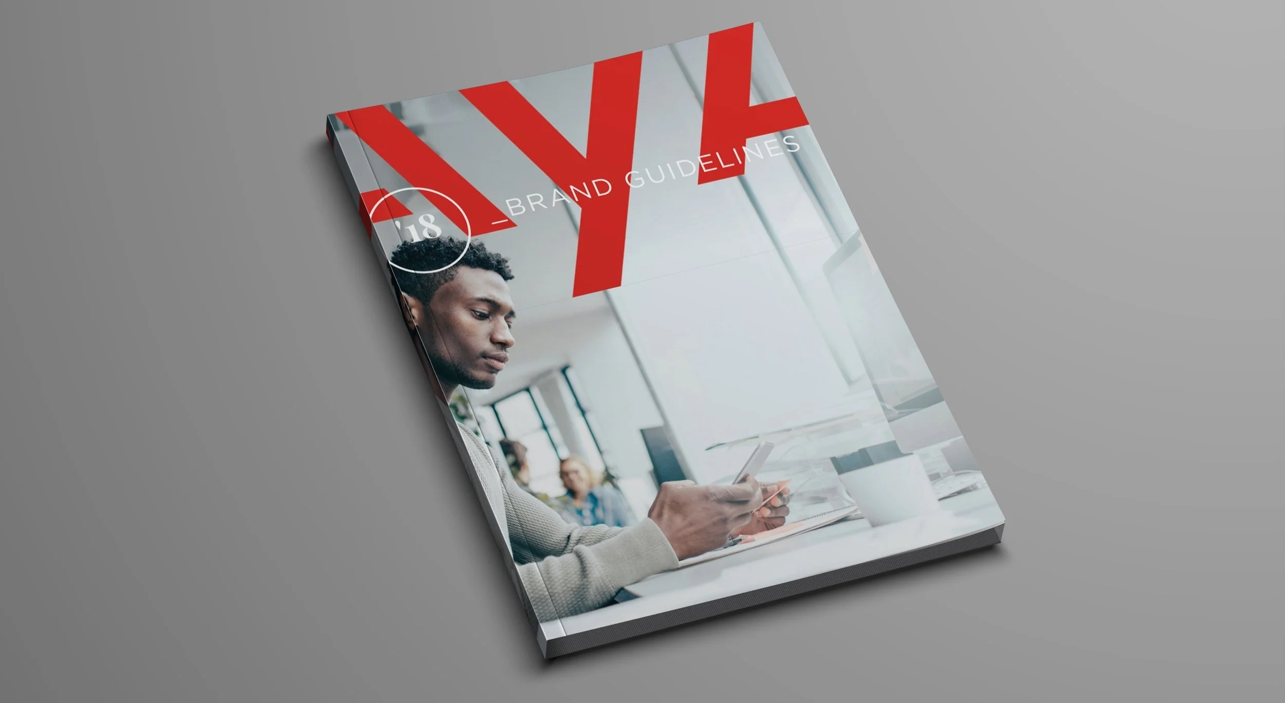
Making connections that matter most
For a cloud communications priding itself on connecting the world through their workstream collaboration services, Avaya’s visual identity was anything but unified. I worked with a team to analyze the disparate elements of their website and materials to provide guidance for their marketing team.
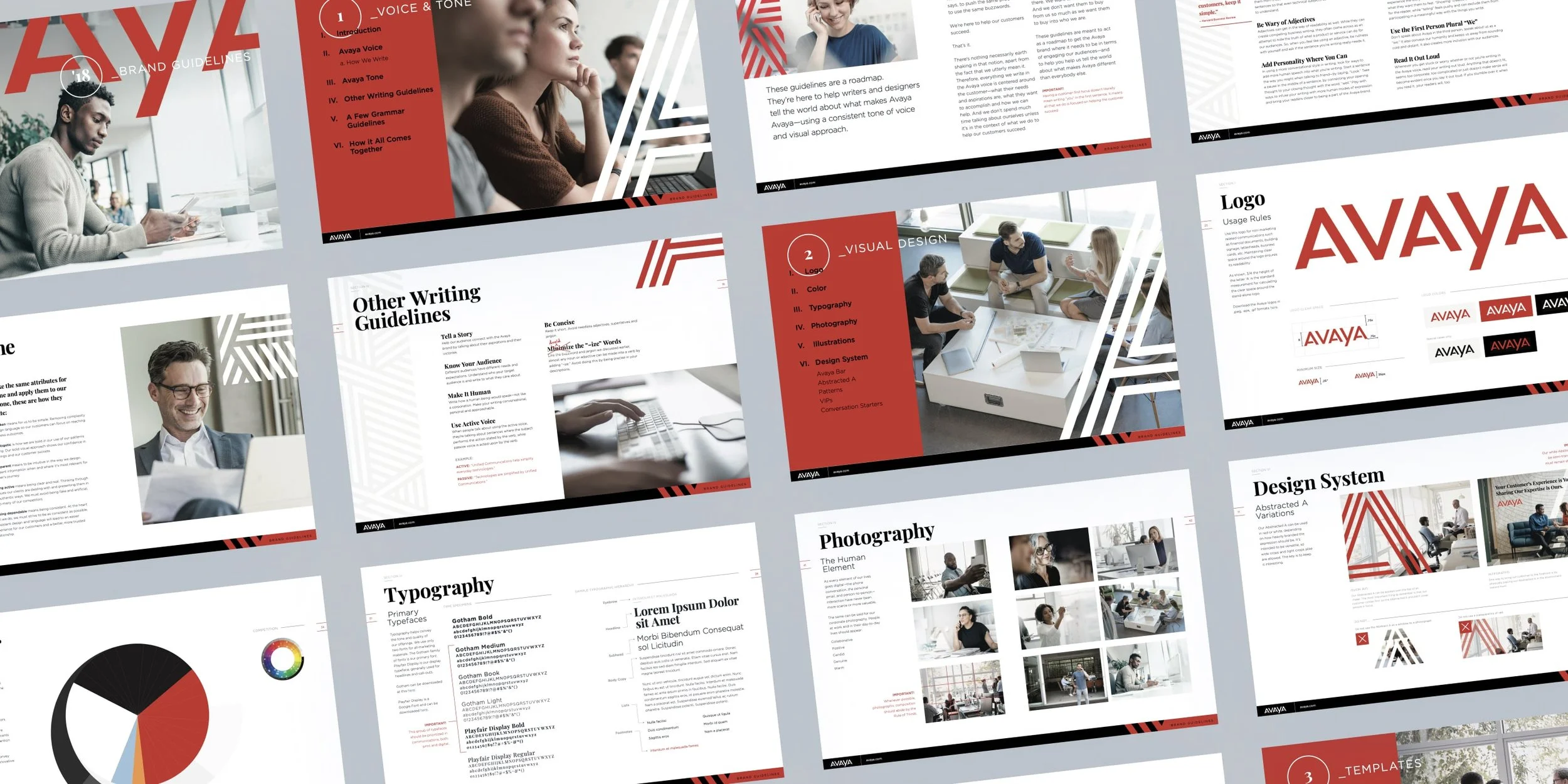
Avaya’s 2018 brand guidelines summarized these findings and gave them the brand vision the desperately needed. Through this tookit we enabled their marketing to become full-blown ambassadors, confident in telling their story.


Leading by example
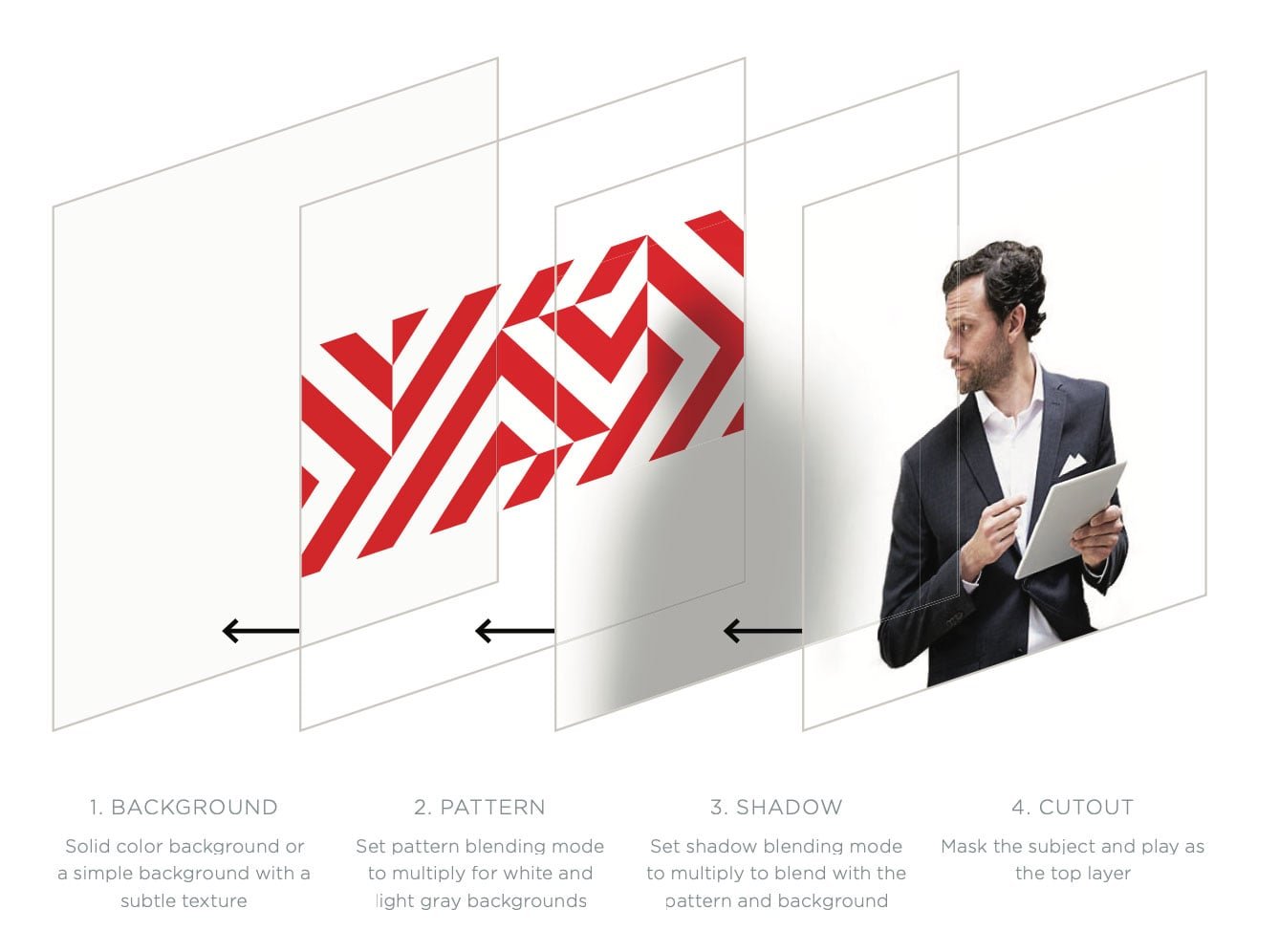
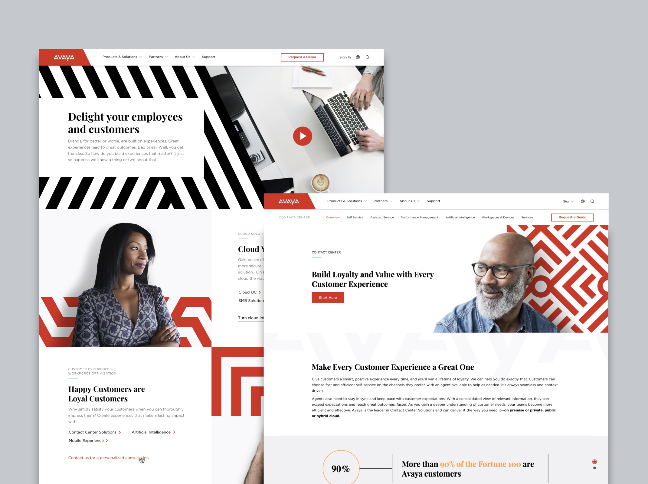
When it comes to a successful brand guideline the proof is in the pudding. It’s essential to demonstrate the extendability of a design system through mockups and, in the case of Avaya, by injecting the updated system into their live website.
This ultimately led to an additional scope of work to revisit their existing user experience, design a responsive UI pattern library, and give the Avaya intranet a visual overhaul.